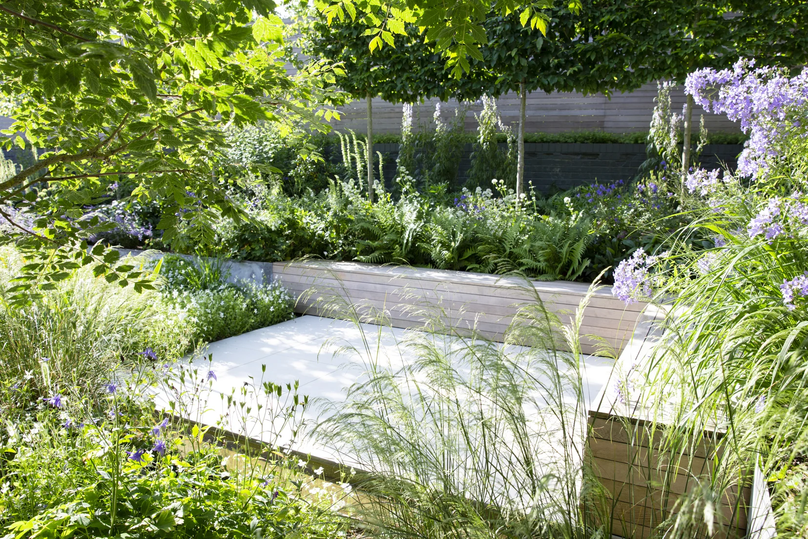
This courtyard garden in Therfield, Hertfordshire forms part of a larger garden scheme wrapping around the house. The brief was to create a contemporary courtyard that would lead from a new architectural extension.
The space had historically formed part of a swimming pool area and the edges of the sunken garden needed to be retained and tall boundaries softened.
We used steel with a bespoke textural finish as the key material to create a series of inter connected elements, including retaining walls, steps, rill, water feature and stepping stones. This contrasts with a cream minimalist porcelain paving designed to align with the interior flooring and create a seamless junction between the house and garden.
Western red cedar timber is used to connect with architectural detailing on the house and create large family seating and relaxing areas, including a cantilevered daybed.
““I asked for a garden that would complement the house, look good all year round and still change with the seasons, says Martin. “It has met the brief more completely than we could possibly have imagined.””
This Project was featured on ‘Love Your Garden’. Watch Alan Titchmarsh explore the garden here.
From Gardens Illustrated Feature: July 2020:
Better by Design
When Martin and Nicola Henderson lost a third of their garden to a new open-plan extension, they saw it as an opportunity to transform the space and bring order; light and colour.
I have always wanted a rill, says Martin Henderson. "It was up there on the wish list when we had our garden redesigned."
In 2016, after seven years living in a converted Victorian pub, not far from the Essex town of Saffron Waldon, Martin and his wife Nicola commissioned a contemporary extension to accommodate their growing family and in the process lost a third of their garden to building work. It had high walls, confers and banked borders sloping away from a shady central lawn. "We never saw the change as a problem." says Martin. "Instead it gave us an opportunity to do something completely different with a difficult space.
Today the overall impression is of order, light and colour. With the sliding glass doors of the sleek, new, open-plan family Kitchen pushed back, there is a seamless link between the house and garden. The same pale porcelain floor tiles have been used inside and out, the strong rectilinear design of the garden has been perfectly aligned with key architectural details on the extension, and Martin now has not one but two intersecting rills drawing his eye out to flower beds filled with bold swathes of perennials, clipped box and ornamental grasses.
This stunning garden is the work of award-winning designer Cassandra Crouch. As well as the water rill, the Hendersons brief included a built-in Kitchen and outdoor eating area, with clean lines and a strong structure balanced by lots of plants, and some way of softening the boundary walls. "There are more traditional garden areas wrapping the older parts of the house, but this section was specifically conceived as a contemporary, grown-up space to complement the extension” says Cassandra.
The awkward level changes became a driver for the design. The steps leading down from the house are now broad and shallow, giving them a sculptural impact that is enhanced by a steel water chute, slicing the space in two. The boundaries have been faced with horizontally slatted trellis and are largely hidden by a hornbeam stilt hedge in raised beds filled with flowering perennials.
The open dining terrace is framed on one side by a sea of vivid violet-flowered Nepeta x faassenii Kit Cat and on the other by a mass of Deschampsia cespitosa. Next to this a beautitul specimen Koelreuteria paniculata has been underplanted with a loose combination of woodland perennials chosen to withstand the shade it casts.
At the bottom of the garden, a second, semi-sunken terrace is surrounded by raised beds and built-in timber seating. From down here, settled on a slatted Western red cedar bench, you view the garden through a veil of plants. Turn to look back up at the house and you notice the steps are faced in a beautifully acid-etched steel that echoes the cantilevered steel canopy shading the top terrace. It is this attention to detail that makes every part of the garden sit so well together.
The raised beds are level with the top of the original sloped banks, creating borders that align with the base of the boundary walls. This gives a clean visual, and the imported top soil helped improve growing conditions within these beds.
Cassandra designed the raised beds, the steps, rill and water chute as an interconnecting series of steel boxes, which were manufactured in a workshop and literally slotted together on site. "We call it the Meccano garden, and it has worked tremendously well," she says.
"I asked for a garden that would complement the house, look good all year round and still change with the seasons, says Martin. "It has met the brief more completely than we could possibly have imagined."
““This stunning garden is the work of award-winning designer Cassandra Crouch.””
Design Ideas
• Balance mass and void by softening a strong rectilinear design with plenty of plants. This design uses 40 per cent open space with 60 per cent planting.
• Limit the palette of materials to create a unified feel. Here, textural crushed limestone in the same colour as the exterior tiles is the only addition to the steel cladding and Western red cedar selected by the architect.
• Perennials used en masse give a contemporary, structured feel. You don’t necessarily have to use different plants, just plant them in a different way.
• Detail is important in any design. Use specialist external contractors and fabricators who have experience of exterior lanascaping.


